With all recreational map apps there are particular features that are both good and bad to the user experience, our goal with this survey was to determine what map apps people like to use and the key feature that stand out to the users, such as tools, map formats, tracking and GPS. Along with their pain points about the apps as well. From this information we hope it will provide a direction to a map application that we will design.
The people who are participants in this survey were asked to participate depending on whether or not they use any navigational maps.
We chose to have a sample size of 8 participants. This was because we wanted to research more about the apps that different people use and the differences between multiple apps.
We chose to use an informal interview process to learn more about the apps that people used when outdoors. There was a list of about 10 talking points that we followed however, in some cases it deviated from that path and lead to other questions that weren't included in the list. It was more of a conversation style interview where the person would tell us about themselves and what they like to do while also talking and relating to them at the same time. It was more or less to get themselves thinking about what kinds of pains and gains that they encounter when using the apps that they most frequently use when they're outdoors.

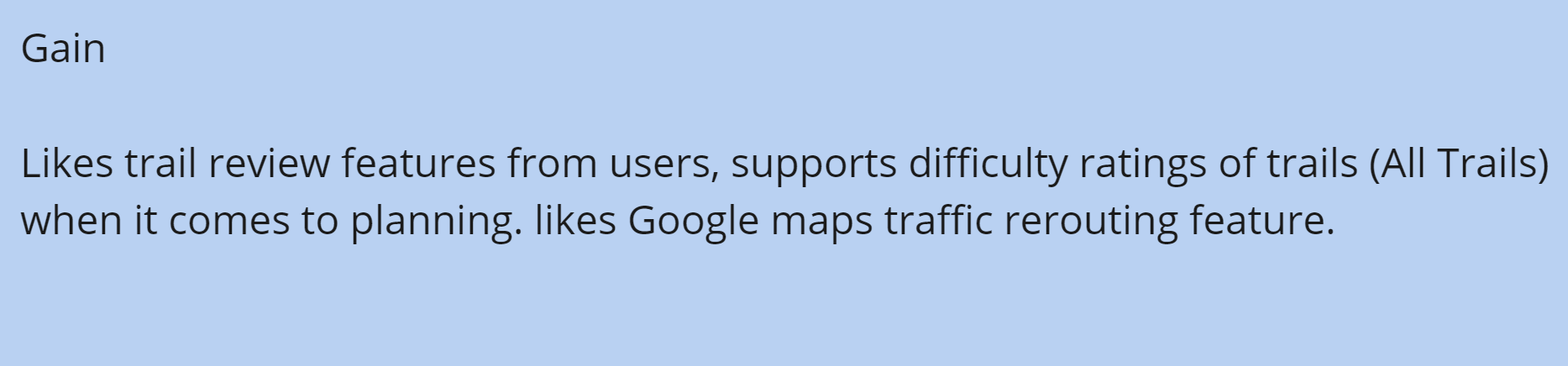
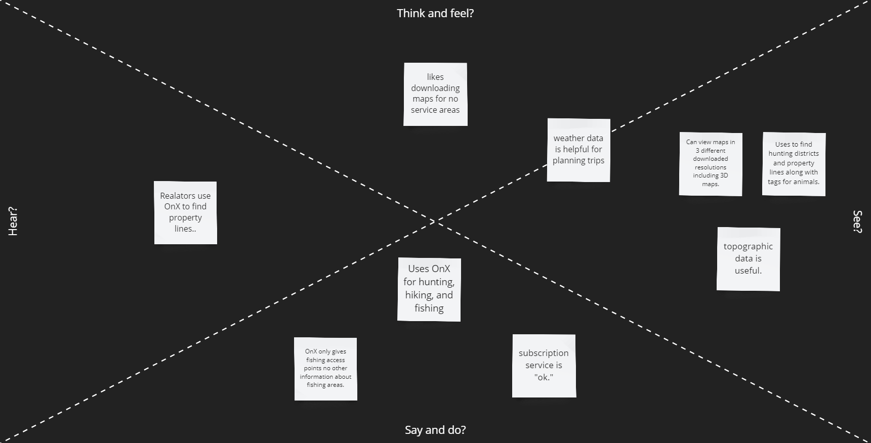


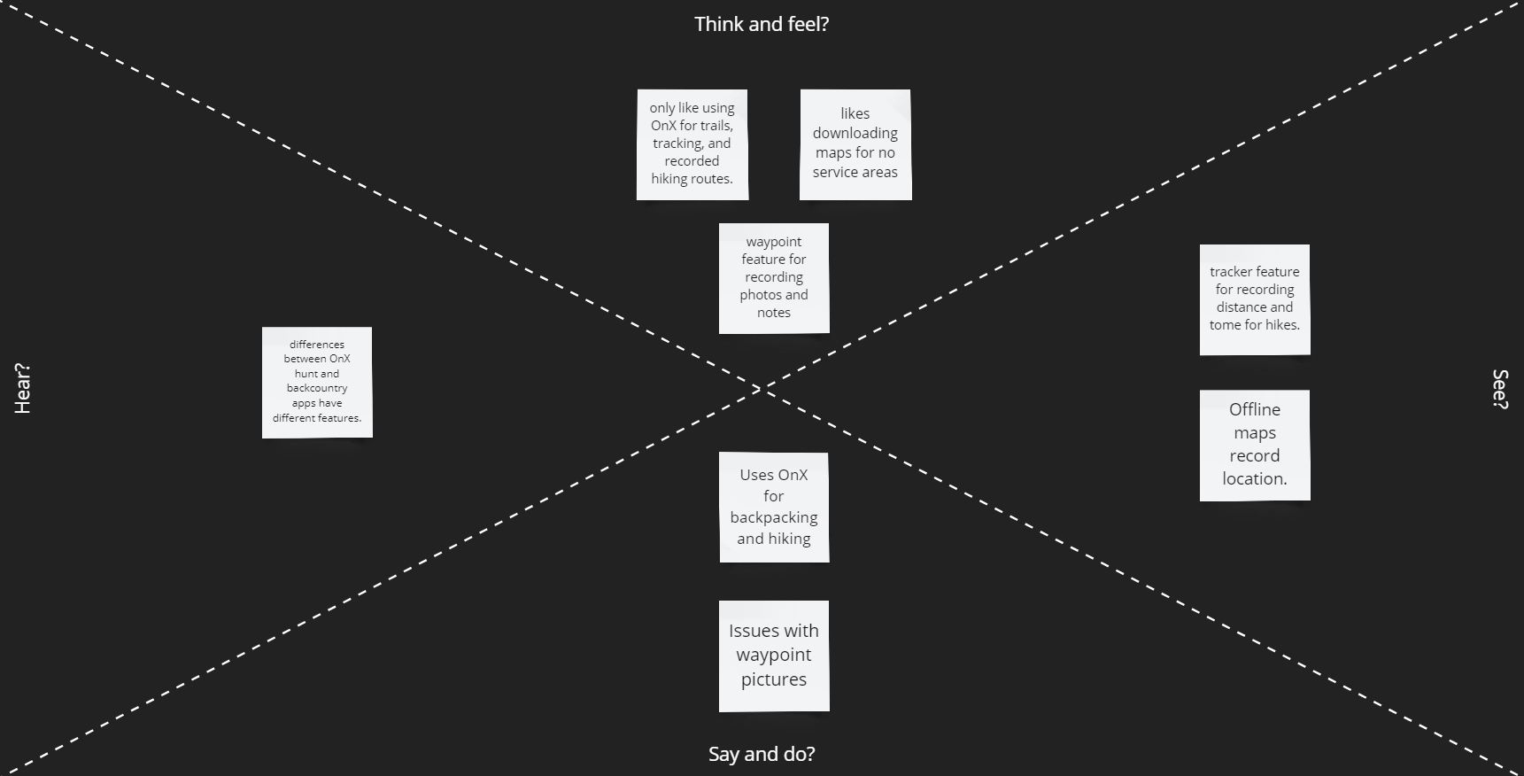
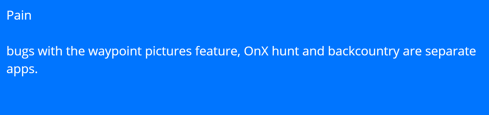
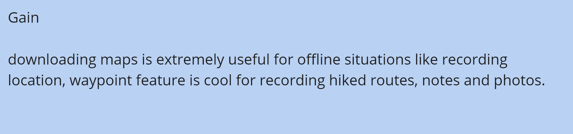
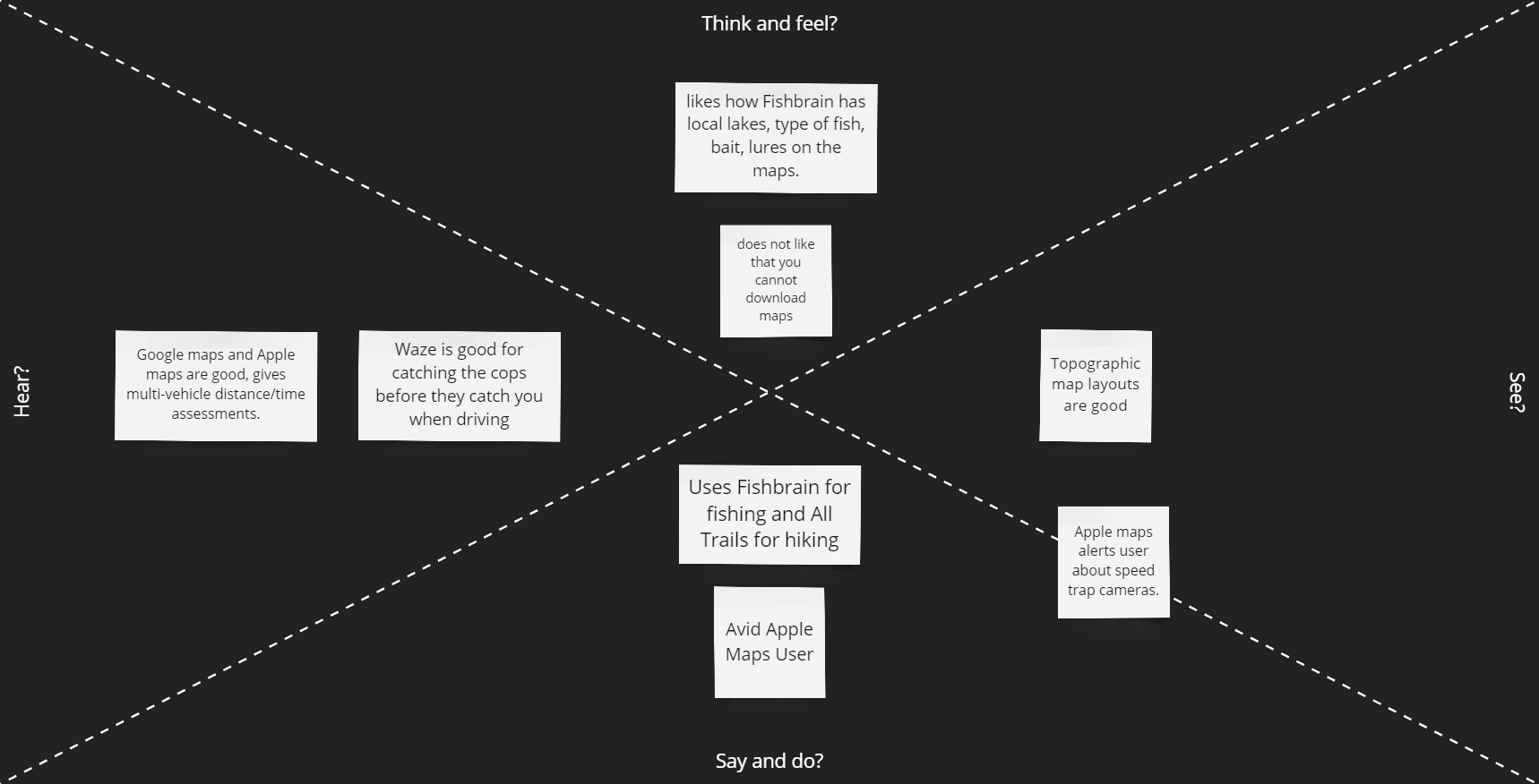
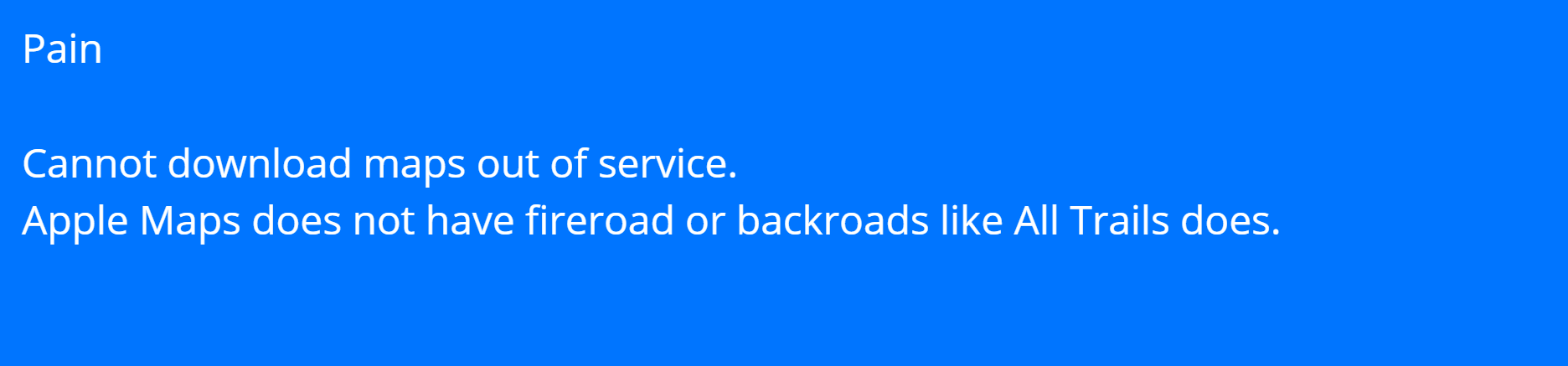
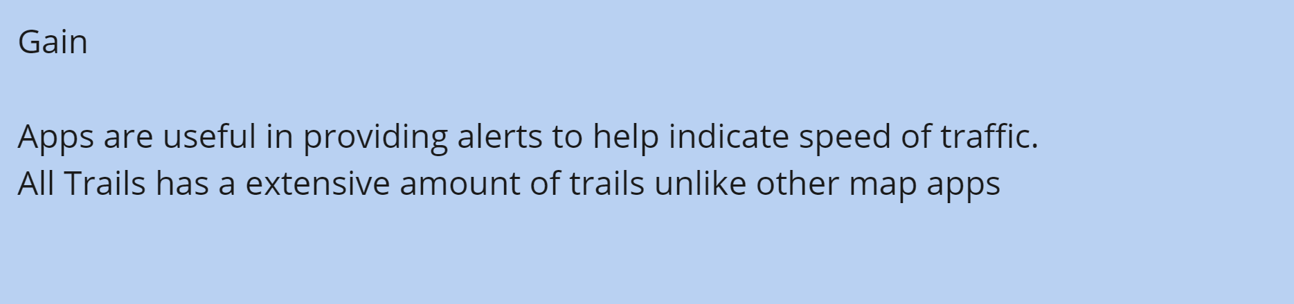
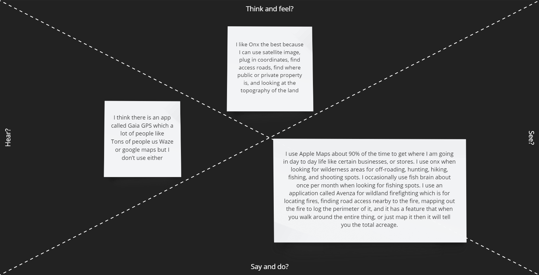
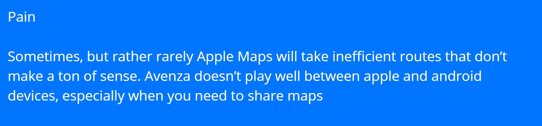
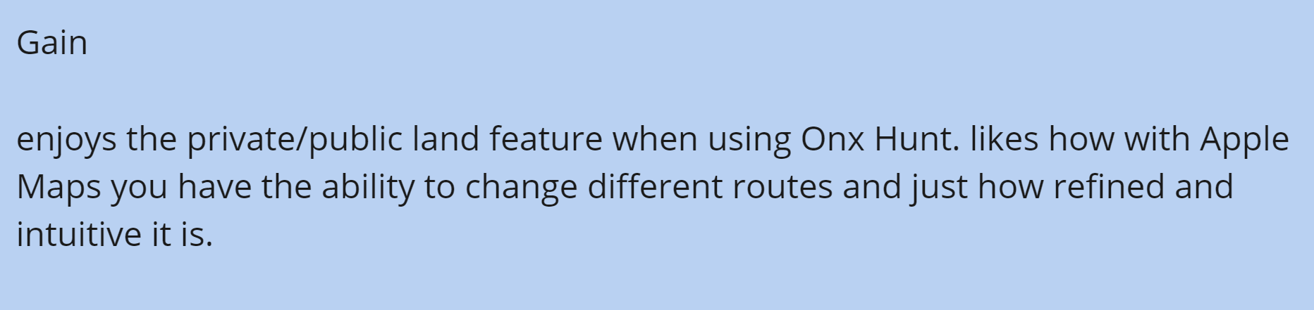
From the Survey we discovered that most users prefer not to have a paywall. From the analysis of applications like Google Maps, Waze, and Apple Maps, the users like features that help with commuting times but also warn them of potential dangers of traffic (speed cams and police using radar guns). Google Maps also goes into detail on GPS locations you are traveling to. Applications such as Alltrails, OnX, Gaia GPS, and Strava have location recording features such as downloading maps to use offline and recording your trips outdoors regardless of the activity. OnX only conveys fishing access points while Fishbrain gives a more in-depth analysis of fishing locations, lures, etc. Another issue with OnX is that the app has separate versions for different uses instead of making all features accessible in a single app. We will move in the direction of designing an application that allows you to use all their features regardless of activity in a single app to improve the User's experiences.
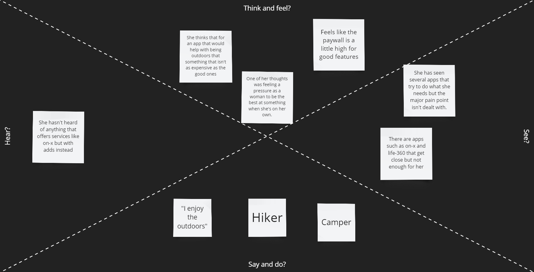
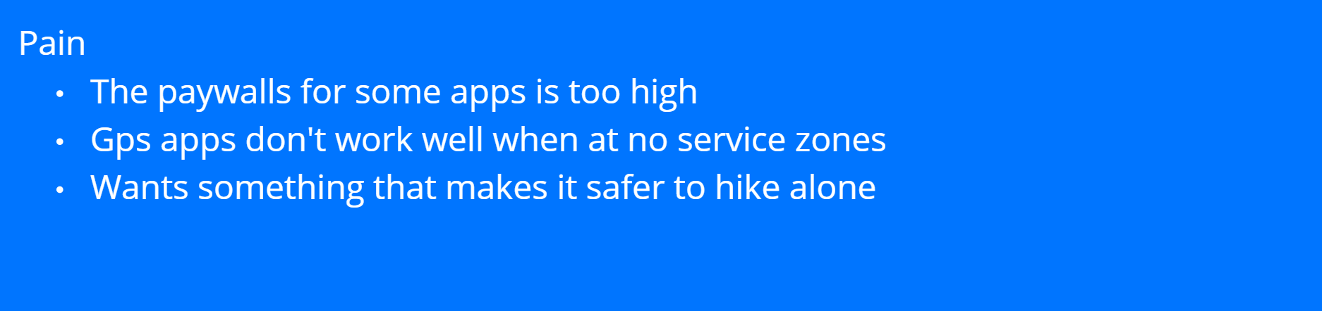
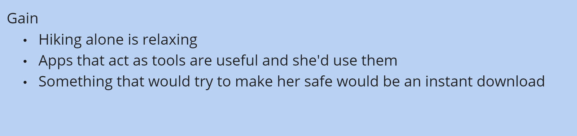
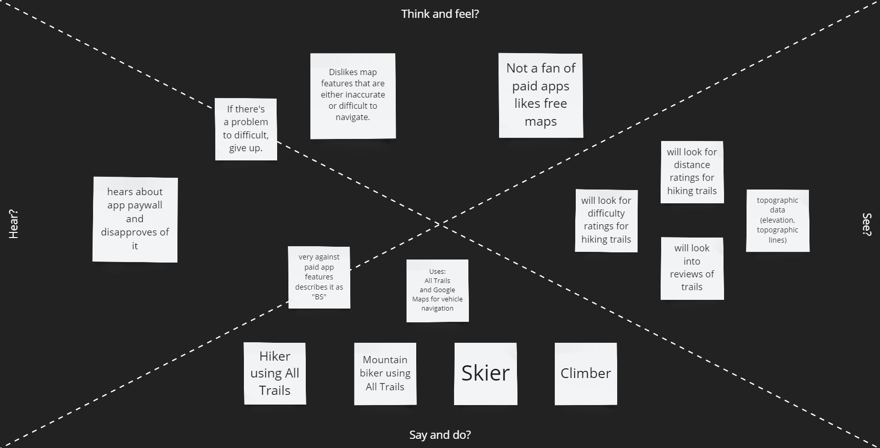
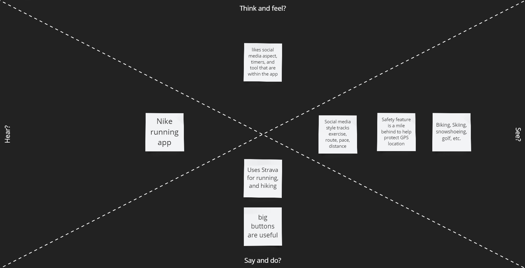
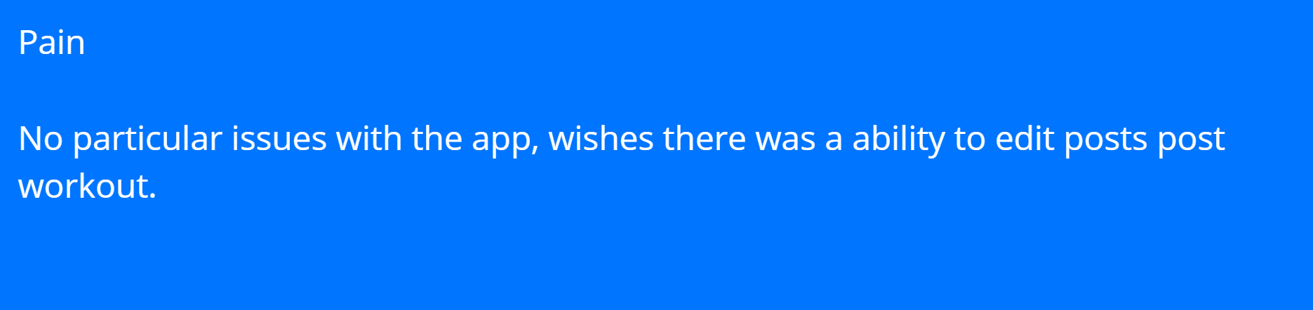
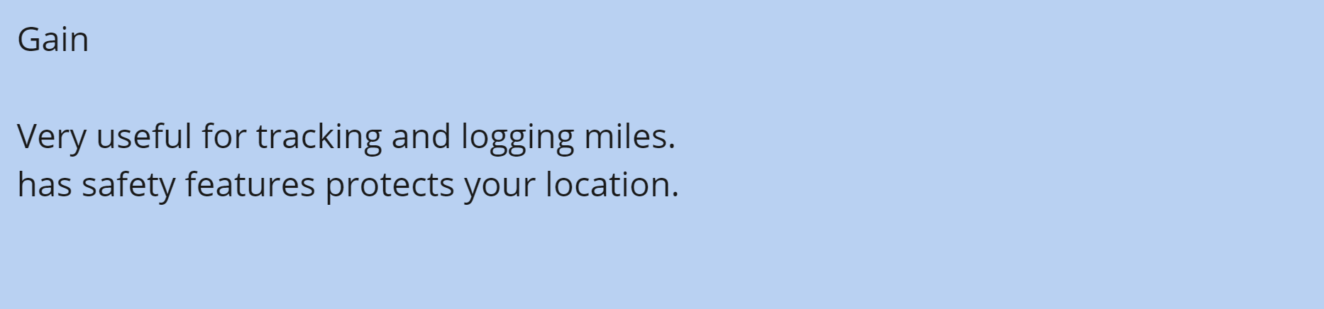
The persona is designed to define an example of a proper outdoors man, with their wants, needs, and frustrations. Which were collected from the interviews in Stage 1.
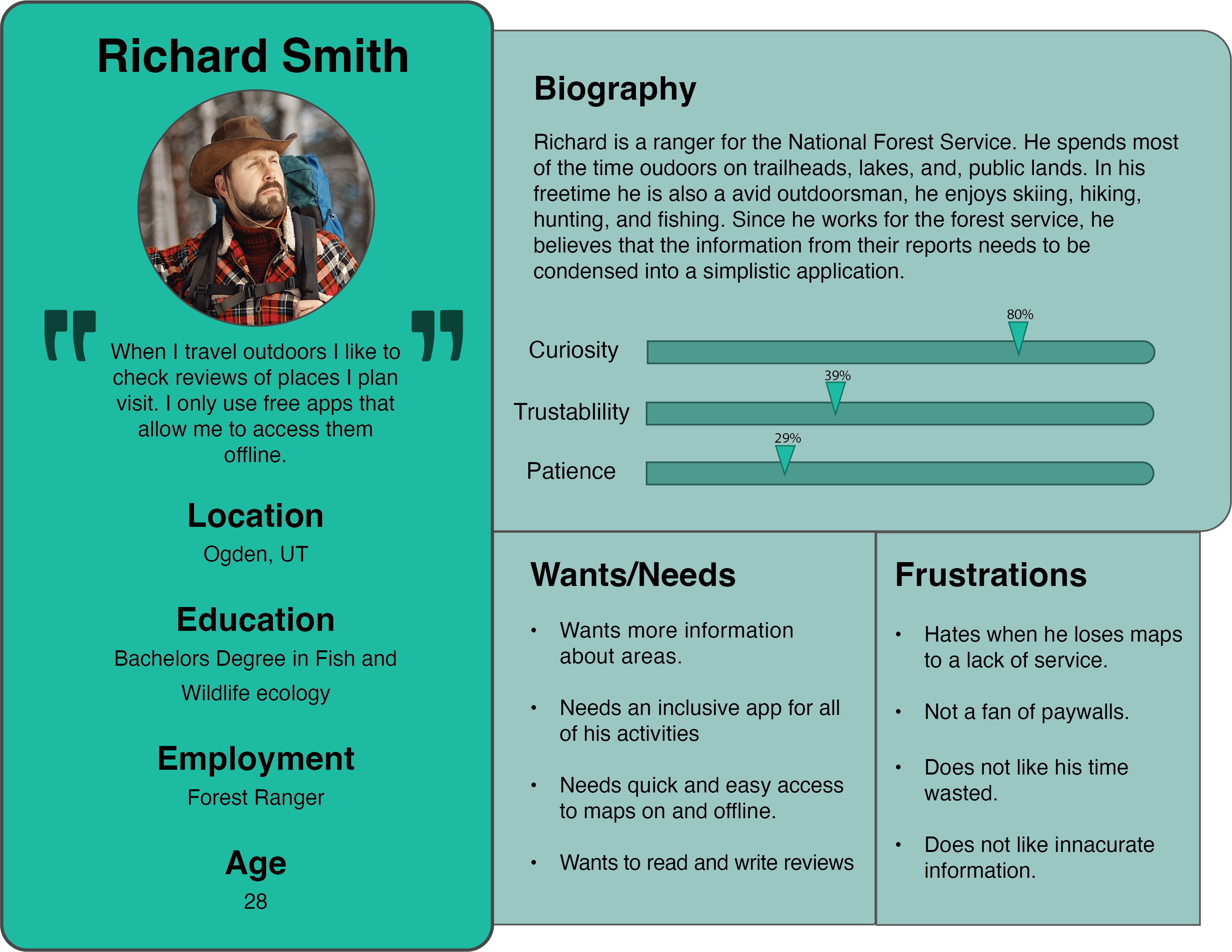
From developing the persona and business model the general target audience for the application is the average outdoorsman. Using geolocation data and GPS features to help inform users about areas they plan to use recreationally. Data for this service can be backed by the US Forest Services and Fish and Wildlife agencies. Including a shopping/advertisement feature to the application that is its own entity, meaning it does not conflict with the map usability, and helps users shop for the activities they do separate from the maps.
We decided that for our mind map we would throw ideas onto a whiteboards and pick from some of them. We divided the board into four separate sections; Features, Content, Design Elements, and Navigation. The features being what we wanted our app to bring to the users. Content was for what fills the apps. Design elements made us focus on what it should look like. Finally, navigation, how we wanted the user move through our app. Anything that we though of at the time would be classified and thrown up onto it. From that list we would then pick and choose the items and ideas. Making sure to choose things that would bring us closer to a first prototype. We took a look at what we had on the board and put blue stars next to the things that should be important and might be our highest priority. This gave us a decent number of ideas to work from and reference when making the low and high fidelity models.
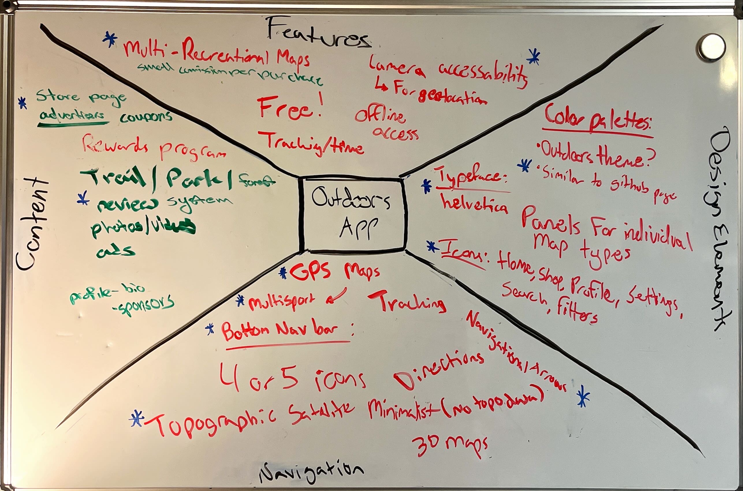
From the mind-mapping step of the project, a consensus was made about stylistic elements such as typeface, icon choices, and color palettes. A bottom nav bar is best suited for the navigation within the application and the maps in the app should be aimed toward multiple activities to appeal to varying users. The trail review system will include photos and other general location information such as directions, distance, etc. This allows users to give reviews and collect location information from useful sites such as the US Forest Service. The “Store” page is still under discussion due to uncertainty about how it will be implemented.
The low fidelity wireframe was used to provide guidance on where pages of the application will be placed for the high-fidelity prototype. We included some important features such as the login and onboarding, and drafted the main pages and layouts that were explored but were revised in the high-fidelity version.
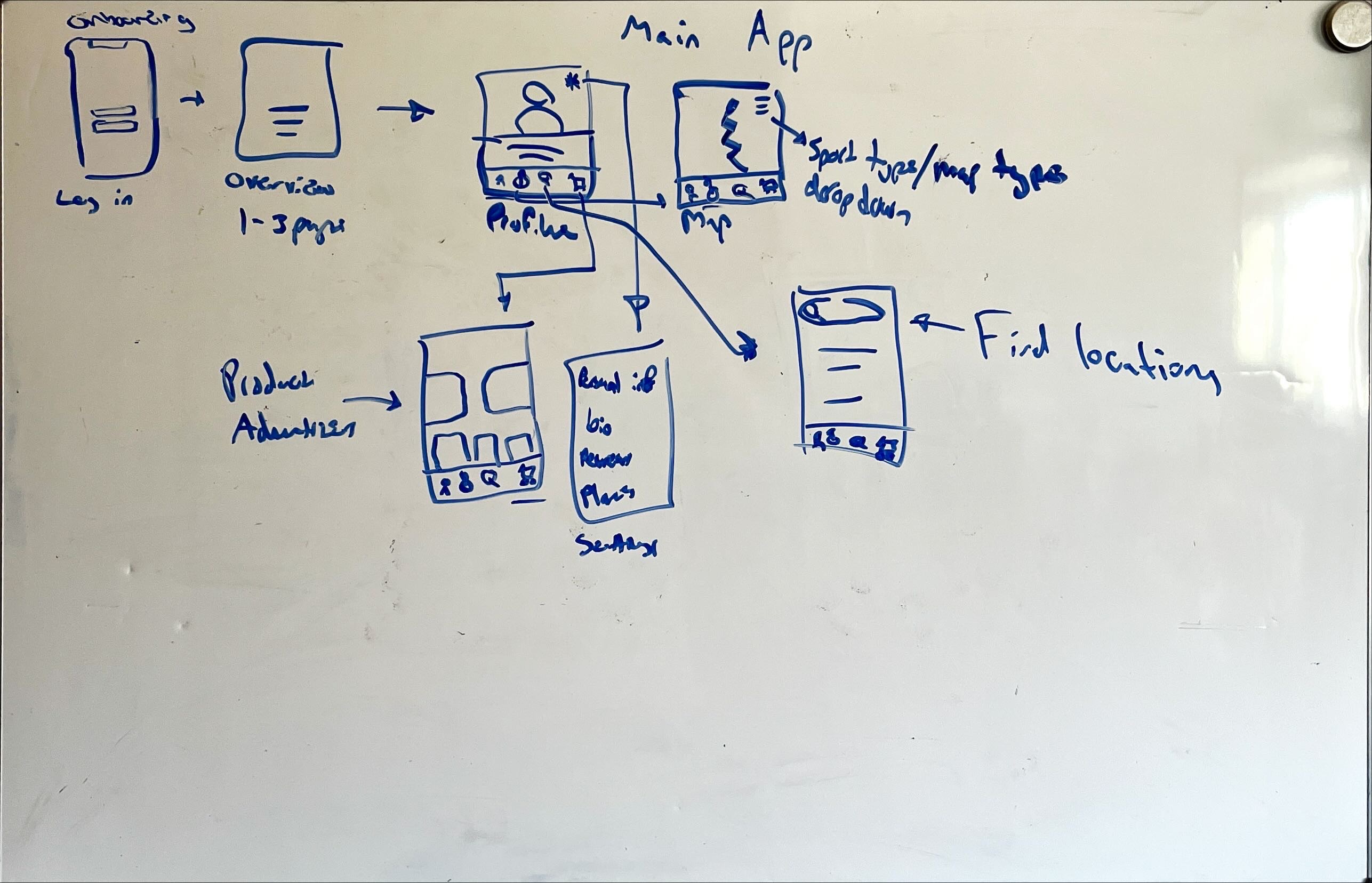
The High-fidelity wireframe came with many more elements that need to be made; icon sets (simple and complex), color palettes and buttons were needed in the creation of this wireframe. Which is why a style guide was utilized in its development. This provided the ability to create a consistent design style of the wireframe allowing the pages within the app to feel like they belong together. Compartmentalizing of features makes the app feel simplistic without compromising the versatility of the app.
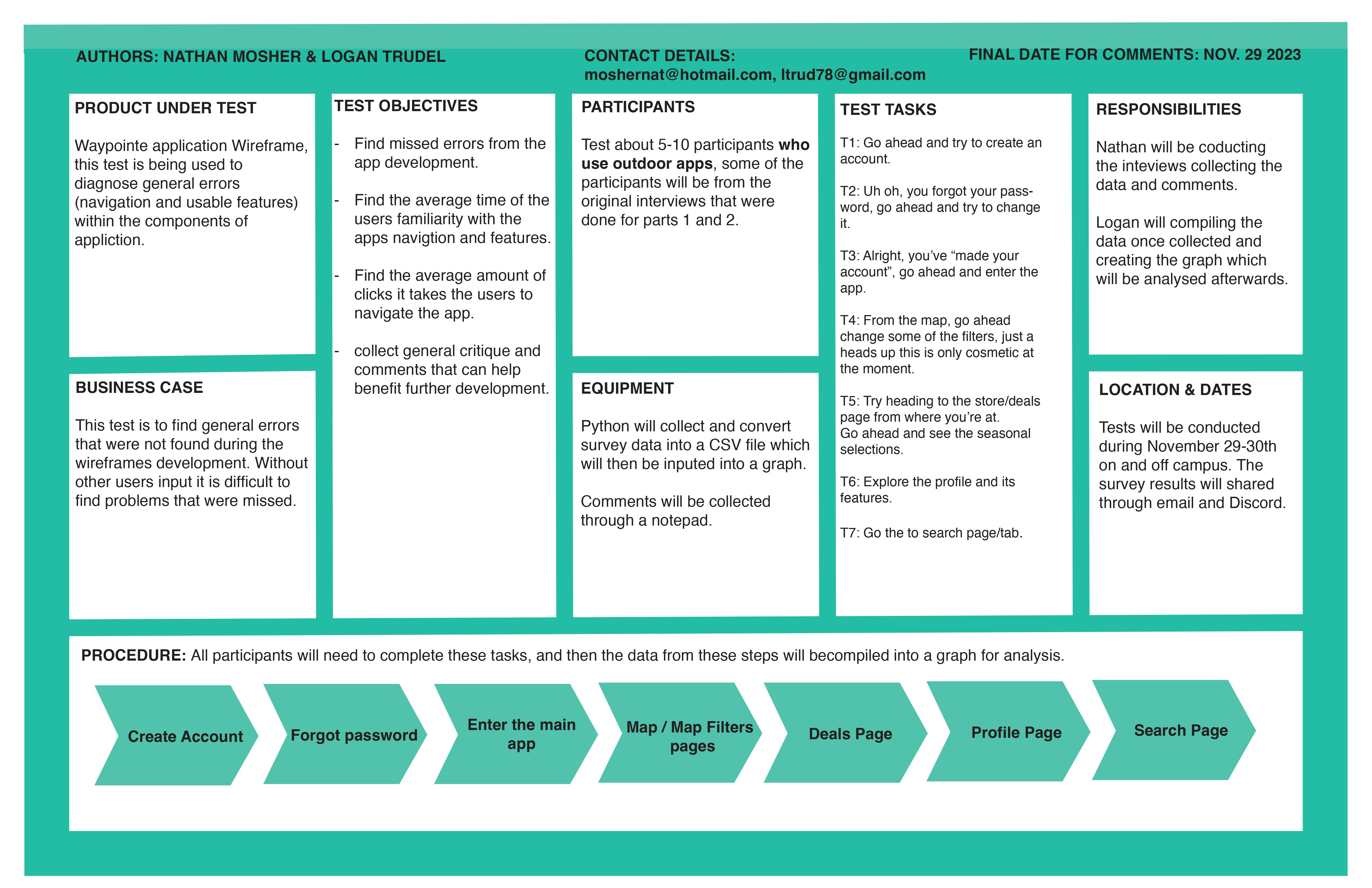
For our research we wanted to test a couple of key values when it came to our app
We felt that tracking these values would lead to a more accurate representation of how our app performs for new user. The values that we wanted to focus on were easiness, adaptation time, clicks, and errors.
The testing was done on and off Montana State University campus between Nov 28-30 2023.
There were a couple tools that we utilized during the testing process. We used a python program that the surveyor would use to input information that they collected. That collected data would then be submitted to a file called data.csv. We also needed a way for the user to interact with out app. We used our wireframe that was already built in Adobe XD. Which allowed us to start the file on a mobile device and interact with it like it was an app. We also used a click counter and a timer for measuring some of the other data that we were collecting. Python was utilized again to read the data in the csv file and generate graphs.
Nathan Mosher was responsible for the data collection and Logan Trudel was responsible for the processing of the data collected. Both parties were involved in the designing of the testing process.
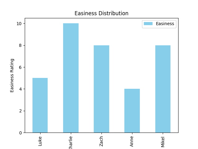
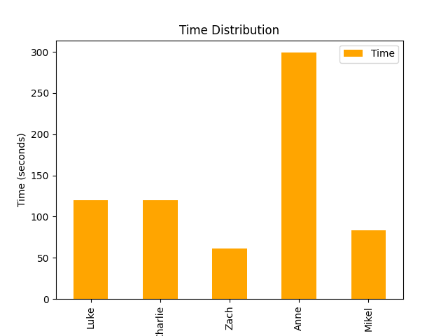
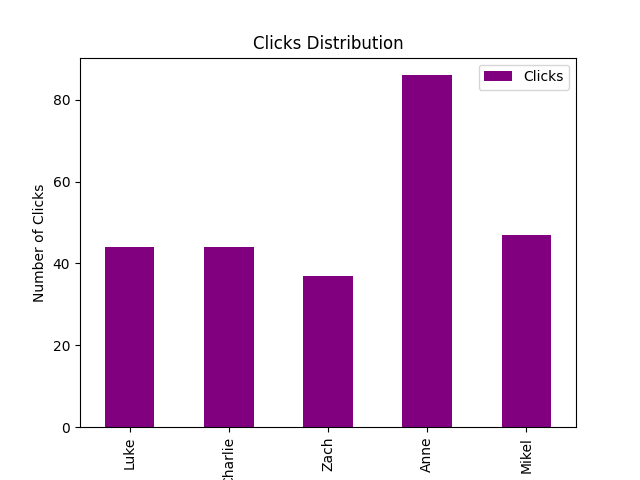
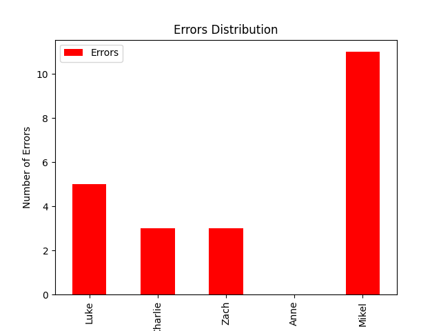
Testing five people allowed us to get a decent amount of initial data. These graphs represent the raw data collected from each person. Illustrating the differences between five different users.
Figure one represents the easiness rating that each user gave. After the test concluded they were asked how easy the app was to navigate from a scale of 1-10.
Figure two represents the time that it took for each user to feel that they could comfortably navigate though the app.
Figure three represents the total amount of clicks that it took for the user to complete all the assigned tasks.
Figure four represents the total amount of errors that each user encountered when completing their assigned tasks.
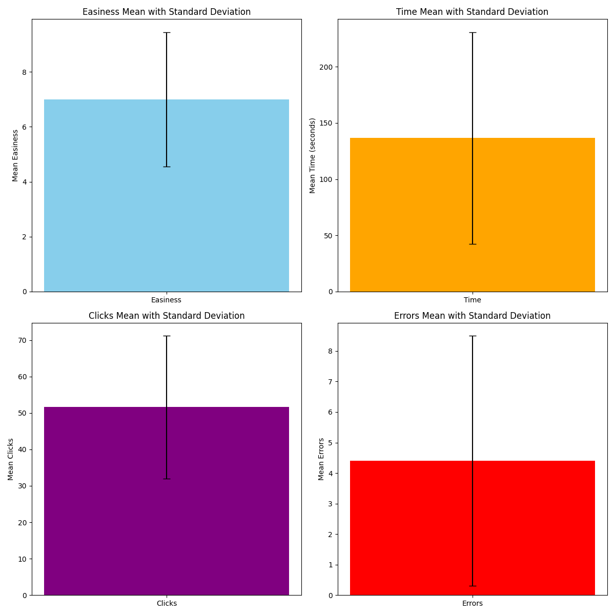
These images represent the same information mentioned up above. However, the mean values of the data as well as the standard deviations are now displayed. We can see that on average 7 was the easiness score, 140 seconds was the time, 51 was the amount of clicks, and 4.5 was the value for total errors.
We found that there might be a correlation between some of the data collected, however, more statistical tests must be done before that conclusion is settled. We hypothesize that users what averaged a higher amount of clicks and errors might rate the app as more difficult, compared with users that averaged lower values. Minimizing the amount of steps and clicks that it takes to navigate though the pages and setting should be one the higher priority changes the we follow through with. We also found that here is a large deviation of times and errors when compared to the mean values of those categories. Some users ran into significantly less errors compared to others, which may have influenced their difficulty score. The same conclusion could possibly be reached with adaptation time as well. Where the longer the user used to get used to the app the more difficult they might deem it. With these hypothesis in mind we might be able to drastically improve the user experience of our app.
Here's the link to the github with all the code used for the collection and illustration of the data
We received a couple comments from the users that we tested. Of those comments here are some of the notable ones. The search and map pages could use more interactive features. The search bar needs to have more linked content. Finally, the map could be zoomed out more for easier viewing. We believe that these comments were the most impactful when if came to the design and interaction with our app. The changes that would be coupled with these comments are not very hard to obtain. Only some simple tweaks are needed for the app to be more interactive and have a better user experience.
# survey.py created by Logan Trudel
# This program is used for the collection of user data
#   and should be run in a python supported terminal

# Here is the csv file that we used,
#       Name,FailedPages,Easiness,Time,Clicks,Errors
#       Luke,FALSE,5,120,44,5
#       Charlie,FALSE,10,120,44,3
#       Zach,TRUE,8,61,37,3
#       Anne,FALSE,4,299,86,0
#       Mikel,FALSE,8,83,47,11

import csv
import os

def survey():
    survey_data = []

    while True:
        person_name = input("Enter the person's name (or 'done' to finish): ")
        if person_name.lower() == 'done':
            break

        person_data = {"Name": person_name}

        # Collect survey information for the current person
        person_data["FailedPages"] = input("Were there any pages that failed to show or function? (y/n)").lower() == 'y'
        person_data["Easiness"] = how_easy()
        person_data["Time"] = how_long()
        person_data["Clicks"] = how_many_clicks()
        person_data["Errors"] = how_many_errors()

        survey_data.append(person_data)

    # Write data to CSV file
    append_to_csv(survey_data)

# checks if the file exists and then writes to it
def append_to_csv(survey_data):
    file_exists = os.path.isfile('data.csv')

    with open('data.csv', mode='a', newline='') as csv_file:
        csv_writer = csv.writer(csv_file)

        # If the file doesn't exist, write the header
        if not file_exists:
            header = ["Name", "FailedPages", "Easiness", "Time", "Clicks", "Errors"]
            csv_writer.writerow(header)

        # Write the data per category
        for person_data in survey_data:
            csv_writer.writerow([
                person_data["Name"],
                person_data["FailedPages"],
                person_data["Easiness"],
                person_data["Time"],
                person_data["Clicks"],
                person_data["Errors"]
            ])
# Records the easiness for each user
def how_easy():
    return input("How easy was the task? 1 - 10: ")

# Records how long each user took to get used to the app
def how_long():
    return input("How long did it take for the person to get familiar with the app? (seconds): ")

# Records how many clicks the user did
def how_many_clicks():
    return input("How many total clicks did the user do? : ")

# Records how many errors the user encountered
def how_many_errors():
    return input("How many errors did the user encounter? : ")

def main():
    survey()

if __name__ == "__main__":
    main()
# graphs.py created by Logan Trudel
# This program generates graphs based on data in
#   the generated data.csv file


# Importing the necessary libraries
import pandas as pd
import matplotlib.pyplot as plt

def generate_graphs():
    # Read data from CSV file
    df = pd.read_csv('data.csv')

    # Plotting
    plot_failed_pages(df)
    plot_easiness(df)
    plot_time(df)
    plot_clicks(df)
    plot_errors(df)

    # Show all plots
    plt.show()

def plot_failed_pages(df):
    # Plotting Failed Pages Distribution
    plt.figure(figsize=(8, 6))
    df['Name'].value_counts().plot(kind='bar', color=['red', 'blue'])
    plt.title('Failed Pages Distribution')
    plt.xlabel('Name')
    plt.ylabel('Count')
    plt.show()

def plot_easiness(df):
    # Plotting Easiness Distribution
    plt.figure(figsize=(8, 6))
    df.plot(x='Name', y='Easiness', kind='bar', color='skyblue')
    plt.title('Easiness Distribution')
    plt.xlabel('Name')
    plt.ylabel('Easiness Rating')
    plt.show()

def plot_time(df):
    # Plotting Time Distribution
    plt.figure(figsize=(8, 6))
    df.plot(x='Name', y='Time', kind='bar', color='orange')
    plt.title('Time Distribution')
    plt.xlabel('Name')
    plt.ylabel('Time (seconds)')
    plt.show()

def plot_clicks(df):
    # Plotting Clicks Distribution
    plt.figure(figsize=(8, 6))
    df.plot(x='Name', y='Clicks', kind='bar', color='purple')
    plt.title('Clicks Distribution')
    plt.xlabel('Name')
    plt.ylabel('Number of Clicks')
    plt.show()

def plot_errors(df):
    # Plotting Errors Distribution
    plt.figure(figsize=(8, 6))
    df.plot(x='Name', y='Errors', kind='bar', color='red')
    plt.title('Errors Distribution')
    plt.xlabel('Name')
    plt.ylabel('Number of Errors')
    plt.show()

if __name__ == "__main__":
    generate_graphs()
# graphs_calculated.py created by Logan Trudel
# This program generates graphs based on data in
#   the generated data.csv file and displays means
#   and standard deviation.


# Importing the necessary libraries
import pandas as pd
import matplotlib.pyplot as plt

def calculate_statistics(df):
    # Calculate mean and standard deviation for each category
    # Selecting the specified categories and calculating their mean and standard deviation
    means = df[['Easiness', 'Time', 'Clicks', 'Errors']].mean()
    stds = df[['Easiness', 'Time', 'Clicks', 'Errors']].std()

    return means, stds

def plot_statistics(means, stds):
    # Display the calculated statistics
    print("Category Data Statistics:")
    print("Means:")
    print(means)
    print("\nStandard Deviations:")
    print(stds)

    # Plotting means with error bars (standard deviations)
    # Creating a 2x2 grid for separate plots
    plt.figure(figsize=(12, 12))

    # Plot for Easiness
    plt.subplot(2, 2, 1)
    plt.bar(['Easiness'], means['Easiness'], yerr=stds['Easiness'], color='skyblue', capsize=5, width=0.5)
    plt.title('Easiness Mean with Standard Deviation')
    plt.ylabel('Mean Easiness')

    # Plot for Time
    plt.subplot(2, 2, 2)
    plt.bar(['Time'], means['Time'], yerr=stds['Time'], color='orange', capsize=5, width=0.5)
    plt.title('Time Mean with Standard Deviation')
    plt.ylabel('Mean Time (seconds)')

    # Plot for Clicks
    plt.subplot(2, 2, 3)
    plt.bar(['Clicks'], means['Clicks'], yerr=stds['Clicks'], color='purple', capsize=5, width=0.5)
    plt.title('Clicks Mean with Standard Deviation')
    plt.ylabel('Mean Clicks')

    # Plot for Errors
    plt.subplot(2, 2, 4)
    plt.bar(['Errors'], means['Errors'], yerr=stds['Errors'], color='red', capsize=5, width=0.5)
    plt.title('Errors Mean with Standard Deviation')
    plt.ylabel('Mean Errors')

    # Adjust layout for better visualization
    plt.tight_layout()
    # Display the plots
    plt.show()

if __name__ == "__main__":
    # Read data from CSV file
    df = pd.read_csv('data.csv')

    # Calculate statistics
    means, stds = calculate_statistics(df)

    # Plot and display statistics
    plot_statistics(means, stds)
From the Data collected in the survey easiness scored an average of 7 meaning we are on the right track when it comes to building an easy to navigate application. The average time for the users to become familiar with the application was just over 2 minutes meaning the app has a relatively fast learning process, The average amount of clicks for the users exploring the entire app is over 50 clicks, and the average amount Errors being around 5, meaning there is improvements to be made with some navigation features such as the map and search pages.
From the comments that were collected post-interview, The recommended improvements were targeted towards the map and search features, with the user wanting to see more features involved in those parts of the app. Suggestions from other fellow graphical UX designers were that the search page and Deals page could use a rework on their layout with buttons and content. The icons on the deals page should redesigned to represent the style guide more closely.
This project was completed by Logan Trudel and Nathan Mosher